library(corrr)
library(gt)
library(palmerpenguins)
library(dplyr)

penguins |>
  select(bill_length_mm, bill_depth_mm, flipper_length_mm, body_mass_g) |>
  correlate(quiet = TRUE) |>
  shave() |>
  gt() |>
  cols_label(term = "") |>
  fmt_number(where(is.numeric), decimals = 2) |>
  sub_missing(missing_text = "") |>
tab_header(title = "Palmer Penguins — correlation matrix")Advanced Statistical Programming using R
Week 11: Statistical Communication & Visualisation
2026-06-25
Announcements
Upcoming deadlines
- Progress Update due Jun 29
- Submit links to rendered website, project plan, and GitHub repo via Moodle
- We will provide group-specific feedback via GitHub issues
- Exam registration closes Jun 29
This week
- Group Project
- Communicating with Data
- Tables with
{gt} - Visualisations with
{ggplot2}
- Tables with
Group Project
Key dates
| Milestone | Date | Submission |
|---|---|---|
| ✓ general feedback in class today | ||
| Progress Update | 29 Jun | URL to rendered site, updated Project Proposal |
| Group reflection — in-class discussion | W14 practical | N/A |
Final submission + group-reflection.qmd |
Due 22 Jul | URL to final website/webpage, group reflection doc |
| Individual contribution statement | Due 23 Jul | PDF via Moodle |
| Oral exam | 29 Jul | — |
From Proposals to Project Plans
- Submitted proposals are Draft Project Plans:
- datasets & IDA: what data are you exploring?
- research questions: what are you trying to investigate or learn?
- analysis methods: how will you investigate your questions?
- data preparation: what preparation is required to interpret your data and conduct your planned analyses?
- final outputs: what formats will you use to document and present your analysis process and findings?
Progress Update
- After last week, you should have some descriptive, explanatory or predictive findings.
- This week, we switch towards communicating your data analysis and findings.
Last Week
Syllabus
Part 1: Statistical Programming Foundations
- W02: Scripts, Functions & Refactoring
- W03: Debugging
- W04: Version Control & Remotes
- W05: Quarto Websites & Collaborative Coding
- W06: R Packages
Part 2: Working with Real World Data
- W07: Initial Data Analysis & Data Cleaning
- W09: Reproducibility, Open Data & renv
- W10: Analysis & Inference
- W11: Statistical Communication & Visualisation
Part 3: Advanced Topics & Summary
- W12: Interactive Data Storytelling
- W13: Multi-lingual Analysis (Python/R)
- W14: Review & Outro
Learning from data
- Three goals: descriptive (what is the state of things?), explanatory (is there a real relationship?), predictive (does this generalise?)
- Exploratory vs confirmatory is orthogonal to the goal — any analysis type can be either; the distinction is whether the question was fixed before looking
- Inference tools differ by goal: CIs for descriptive, hypothesis tests + effect sizes for explanatory, held-out evaluation for predictive
Planning for inference
- A data analysis plan covers the full project; an inference plan is the component where you generalise beyond your sample
- Running tests after exploring is normal — label those findings as exploratory/candidate and treat them as hypotheses for future work
- Each look at the data spends some of the evidentiary budget — standard tools don’t adjust for this automatically
- Write it down: even a paragraph before you start is enough to separate what you planned from what you discovered
{infer}
- Workflow:
specify()→assume()→calculate()→visualize()/get_p_value() assume("t" / "z" / "Chisq" / "F")uses the same theoretical distributions as Stat 1/2- The null plot shows you where your test statistic sits in the null distribution
- Extension:
generate()simulates the null without assuming a distribution
Communicating with Data
Why data communication skills matter
So far you’ve been learning skills and tools for examining and learning from data. However, it is also important to be able to clearly and effectively communicate your findings and how you reached them. Effective communication supports:
- Clarity — well-communicated insight is more useful than a technically correct but unreadable analysis
- Persuasion — analysis only creates impact if it reaches and convinces decision-makers
- Detecting misinformation — understanding how data can mislead makes you a better producer and consumer of analysis
Communication tools for statistical information
We use tables and plots to show:
- descriptive statistics
- patterns and relationships between variables
- regression results
- model uncertainty and diagnostics
Choosing between them depends on:
- what you want to show
- whether you want to display exact values or communicate a message
- who your audience is
Descriptive summary statistics
A numerical summary that gives a “feel” of what the data contains should convey:
- variables in the data and number of observations
- missing values (if any)
- distribution — five-number summaries, or counts/percentages for categorical variables
- correlations between variables
Correlation Tables
Correlation Tables
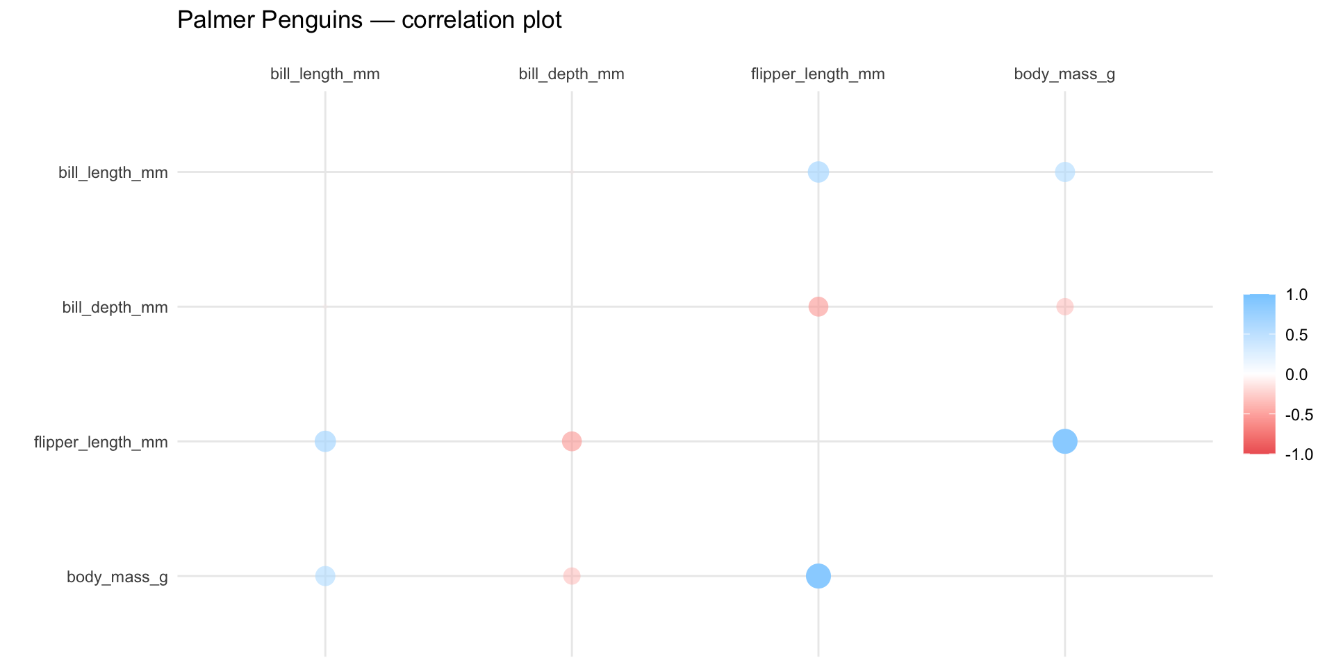
| Palmer Penguins — correlation matrix | ||||
| bill_length_mm | bill_depth_mm | flipper_length_mm | body_mass_g | |
|---|---|---|---|---|
| bill_length_mm | ||||
| bill_depth_mm | −0.24 | |||
| flipper_length_mm | 0.66 | −0.58 | ||
| body_mass_g | 0.60 | −0.47 | 0.87 | |
Correlation Plots
Correlation Plots
Cross-Tabulations
Cross-tabulations (contingency tables) show the frequency distribution of two or more categorical variables simultaneously — how many observations fall into each combination of categories.
library(gt)
library(palmerpenguins)
library(dplyr)
library(tidyr)

penguins |>
  count(species, island) |>
  pivot_wider(names_from = island, values_from = n, values_fill = 0) |>
  gt() |>
  cols_label(species = "Species") |>
  tab_spanner(label = "Island", columns = -species) |>
  tab_header(title = "Palmer Penguins by species and island")
Cross-Tabulations
| Palmer Penguins by species and island | |||
| Species |
Island
|
||
|---|---|---|---|
| Biscoe | Dream | Torgersen | |
| Adelie | 44 | 56 | 52 |
| Chinstrap | 0 | 68 | 0 |
| Gentoo | 124 | 0 | 0 |
Model Results & Diagnostics
The key numerical characteristics of a fitted model typically include:
- parameter estimates — coefficients, odds ratios, hazard ratios
- uncertainty — standard errors, confidence/credible intervals
- model fit — R², AIC, BIC, RMSE, or other diagnostics appropriate to the model type
Model Results Table
library(broom)
library(gt)
library(palmerpenguins)

lm(body_mass_g ~ bill_length_mm + species, data = penguins) |>
  tidy(conf.int = TRUE) |>
  gt() |>
  fmt_number(where(is.numeric), decimals = 3) |>
  cols_label(
    term      = "Term",
    estimate  = "Estimate",
    std.error = html("Std.<br>Error"),
    statistic = md("*t*"),
    p.value   = md("*p*"),
    conf.low  = html("95% CI<br>lower"),
    conf.high = html("95% CI<br>upper")
  ) |>
  tab_header(
    title    = "Linear regression: penguin body mass",
    subtitle = "Predictors: bill length and species"
  )
Model Results Table
| Linear regression: penguin body mass | ||||||
| Predictors: bill length and species | ||||||
| Term | Estimate | Std. Error |
t | p | 95% CI lower |
95% CI upper |
|---|---|---|---|---|---|---|
| (Intercept) | 153.740 | 268.901 | 0.572 | 0.568 | −375.191 | 682.670 |
| bill_length_mm | 91.436 | 6.887 | 13.276 | 0.000 | 77.889 | 104.983 |
| speciesChinstrap | −885.812 | 88.250 | −10.038 | 0.000 | −1,059.401 | −712.223 |
| speciesGentoo | 578.629 | 75.362 | 7.678 | 0.000 | 430.391 | 726.867 |
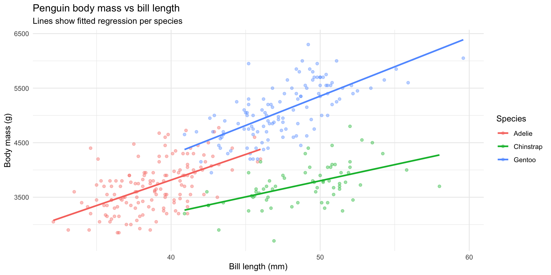
Model Plots
library(ggplot2)
library(palmerpenguins)
library(dplyr)

penguins |>
  filter(!is.na(sex)) |>
  ggplot(aes(bill_length_mm, body_mass_g, colour = species)) +
  geom_point(alpha = 0.4) +
  geom_smooth(method = "lm", se = FALSE) +
  labs(
    x = "Bill length (mm)", y = "Body mass (g)", colour = "Species",
    title = "Penguin body mass vs bill length",
    subtitle = "Lines show fitted regression per species"
  ) +
  theme_minimal()
Model Plots
When to use tables vs. plots
- Use a table when you want to show exact values or the accuracy of the values is important to convey.
- Plots are often more useful for communicating a particular message, trend or pattern.
- You can also combine tables with visualisations!
Case study: heatmap table with formattable
Case study: heatmap table with formattable
| Variables | mpg | disp | wt | hp |
|---|---|---|---|---|
| mpg | 1.0000000 | -0.8475514 | -0.8676594 | -0.7761684 |
| disp | -0.8475514 | 1.0000000 | 0.8879799 | 0.7909486 |
| wt | -0.8676594 | 0.8879799 | 1.0000000 | 0.6587479 |
| hp | -0.7761684 | 0.7909486 | 0.6587479 | 1.0000000 |
Making tables with {gt}
Packages for making tables in R
| Table packages in R | ||
| Package | Output | Strength |
|---|---|---|
knitr::kable |
HTML / PDF / Word | Simple, zero dependencies |
kableExtra |
HTML / PDF | Extensions to kable |
formattable |
HTML | Inline colour and bar formatting |
gt |
HTML / PDF / Word | Layered API, highly customisable |
gtsummary |
HTML / PDF / Word | Automatic summary and model tables |
DT |
HTML | Interactive, sortable and filterable |
Tip
We will focus on {gt} — it has a layered API that generalises to HTML, PDF, and Word, and is actively maintained by Posit.
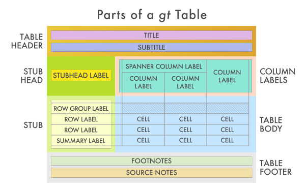
Components of a table
The gt workflow
Start with a data frame, pipe into gt(), then add formatting and annotation layers one at a time:
gt(df) |>
  fmt_number(columns = where(is.numeric), decimals = 1) |>
  cols_label(col_name = "Human Label") |>
  cols_align(align = "right", columns = where(is.numeric)) |>
  tab_header(title = "Title", subtitle = "Subtitle") |>
  tab_source_note(md("Source: ...")) |>
  tab_footnote(footnote = "Note.", locations = cells_column_labels())
Example: Data sample
Show the first few rows of a dataset with clean labels:
Example: Data sample
| species | island | bill_length_mm | bill_depth_mm | flipper_length_mm | body_mass_g | sex | year |
|---|---|---|---|---|---|---|---|
| Gentoo | Biscoe | 49.5 | 16.2 | 229 | 5800 | male | 2008 |
| Adelie | Biscoe | 36.5 | 16.6 | 181 | 2850 | female | 2008 |
| Gentoo | Biscoe | 49.1 | 14.8 | 220 | 5150 | female | 2008 |
| Gentoo | Biscoe | 51.1 | 16.5 | 225 | 5250 | male | 2009 |
| Adelie | Dream | 39.6 | 18.1 | 186 | 4450 | male | 2008 |
| Gentoo | Biscoe | 55.1 | 16.0 | 230 | 5850 | male | 2009 |
Example: Data sample
Improve the column names:
Example: Data sample
| species | island | Bill length (mm) |
Bill depth (mm) |
Flipper (mm) |
Body mass (g) |
sex | year |
|---|---|---|---|---|---|---|---|
| Gentoo | Biscoe | 48.7 | 14.1 | 210 | 4450 | female | 2007 |
| Chinstrap | Dream | 53.5 | 19.9 | 205 | 4500 | male | 2008 |
| Chinstrap | Dream | 50.6 | 19.4 | 193 | 3800 | male | 2007 |
| Chinstrap | Dream | 51.3 | 18.2 | 197 | 3750 | male | 2007 |
| Adelie | Biscoe | 41.1 | 19.1 | 188 | 4100 | male | 2008 |
| Adelie | Torgersen | 38.5 | 17.9 | 190 | 3325 | female | 2009 |
Example: Data sample
Now add formatting and supporting text
library(dplyr)
library(gt)
library(palmerpenguins)
penguins |>
  slice_sample(n = 6) |>
gt() |>
cols_label(
bill_length_mm = html("Bill length<br>(mm)"),
bill_depth_mm = html("Bill depth<br>(mm)"),
flipper_length_mm = html("Flipper<br>(mm)"),
body_mass_g = html("Body mass<br>(g)")
) |>
fmt_number(where(is.numeric), decimals = 1) |>
tab_header(title = "Palmer Penguins — data sample")Example: Data sample
| Palmer Penguins — data sample | |||||||
| species | island | Bill length (mm) |
Bill depth (mm) |
Flipper (mm) |
Body mass (g) |
sex | year |
|---|---|---|---|---|---|---|---|
| Chinstrap | Dream | 54.2 | 20.8 | 201.0 | 4,300.0 | male | 2,008.0 |
| Gentoo | Biscoe | 48.5 | 14.1 | 220.0 | 5,300.0 | male | 2,008.0 |
| Chinstrap | Dream | 55.8 | 19.8 | 207.0 | 4,000.0 | male | 2,009.0 |
| Adelie | Dream | 42.3 | 21.2 | 191.0 | 4,150.0 | male | 2,007.0 |
| Adelie | Dream | 33.1 | 16.1 | 178.0 | 2,900.0 | female | 2,008.0 |
| Gentoo | Biscoe | 50.5 | 15.2 | 216.0 | 5,000.0 | female | 2,009.0 |
Example: Summary statistics
Summarise first, then pipe into gt():
penguins |>
  group_by(species) |>
  summarise(
    n = n(),
    mean_bill = mean(bill_length_mm, na.rm = TRUE),
    sd_bill   = sd(bill_length_mm,   na.rm = TRUE)
  ) |>
  gt() |>
  fmt_number(c(mean_bill, sd_bill), decimals = 2) |>
  cols_label(
    species   = "Species",
    n         = md("*n*"),
    mean_bill = html("Mean bill<br>(mm)"),
    sd_bill   = html("SD bill<br>(mm)")
  ) |>
  tab_header(title = "Bill length by species")
Example: Summary statistics
| Bill length by species | |||
| Species | n | Mean bill (mm) |
SD bill (mm) |
|---|---|---|---|
| Adelie | 152 | 38.79 | 2.66 |
| Chinstrap | 68 | 48.83 | 3.34 |
| Gentoo | 124 | 47.50 | 3.08 |
Example: Grouping Columns
Use tab_spanner() to group related columns under a shared header:
penguins |>
  mutate(year = as.factor(year)) |>
  tidyr::drop_na() |>
  group_by(species, sex) |>
  summarise(across(where(is.numeric), \(x) mean(x , na.rm = TRUE)),
            .groups = "drop") |>
  gt() |>
  cols_label(
    bill_length_mm    = html("Bill length<br>(mm)"),
    bill_depth_mm     = html("Bill depth<br>(mm)"),
    flipper_length_mm = html("Flipper<br>(mm)"),
    body_mass_g       = html("Body mass<br>(g)")
  ) |>
  tab_spanner(label = "Body Measurements", columns = c(bill_length_mm, bill_depth_mm, flipper_length_mm, body_mass_g)) |>
  fmt_number(where(is.numeric), decimals = 1) |>
  cols_align(align = "center", columns = -c(species, sex))
Example: Grouping Columns
| species | sex |
Body Measurements
|
|||
|---|---|---|---|---|---|
| Bill length (mm) |
Bill depth (mm) |
Flipper (mm) |
Body mass (g) |
||
| Adelie | female | 37.3 | 17.6 | 187.8 | 3,368.8 |
| Adelie | male | 40.4 | 19.1 | 192.4 | 4,043.5 |
| Chinstrap | female | 46.6 | 17.6 | 191.7 | 3,527.2 |
| Chinstrap | male | 51.1 | 19.3 | 199.9 | 3,939.0 |
| Gentoo | female | 45.6 | 14.2 | 212.7 | 4,679.7 |
| Gentoo | male | 49.5 | 15.7 | 221.5 | 5,484.8 |
Example: Table head and footer
library(dplyr)
library(gt)
library(palmerpenguins)

penguins |>
  group_by(species) |>
  summarise(
    n         = n(),
    mean_bill = mean(bill_length_mm, na.rm = TRUE),
    sd_bill   = sd(bill_length_mm,   na.rm = TRUE),
    mean_mass = mean(body_mass_g,    na.rm = TRUE)
  ) |>
  gt() |>
  fmt_number(c(mean_bill, sd_bill, mean_mass), decimals = 1) |>
  cols_label(
    species   = "Species",
    n         = md("*n*"),
    mean_bill = html("Mean bill<br>(mm)"),
    sd_bill   = html("SD bill<br>(mm)"),
    mean_mass = html("Mean mass<br>(g)")
  ) |>
  cols_align(align = "right", columns = where(is.numeric)) |>
  tab_header(
    title    = "Penguin measurements by species",
    subtitle = "Chinstrap penguins have the longest bills on average"
  ) |>
  tab_source_note(md("Source: `palmerpenguins` package"))
Example: Table head and footer
| Penguin measurements by species | ||||
| Chinstrap penguins have the longest bills on average | ||||
| Species | n | Mean bill (mm) |
SD bill (mm) |
Mean mass (g) |
|---|---|---|---|---|
| Adelie | 152 | 38.8 | 2.7 | 3,700.7 |
| Chinstrap | 68 | 48.8 | 3.3 | 3,733.1 |
| Gentoo | 124 | 47.5 | 3.1 | 5,076.0 |
Source: palmerpenguins package |
||||
Table design
- Right-align numbers, left-align text, centre-align spanner labels
- Put units in column headers, not in cells (
mm,g,%) - Choose decimal places deliberately — match the precision that matters
- Group related columns with
tab_spanner()
Texts accompanying tables
A table may be accompanied by:
- Title / header — names the table and its scope
- Caption — states the take-away message; why should the reader care?
- Footnotes — explain abbreviations, caveats, or exceptions in specific cells
- Source note — credits the data source
- Alt text — a plain-text description for screen readers (set via
tbl-capin Quarto)
Adding table captions in Quarto
Markdown tables — caption is the last paragraph inside a ::: div with a tbl- label:
Communicating with Visualisation
Communication starts with intent
Before choosing chart type, or creating a custom visualisation, you need to know what you are trying to communicate. You should answer:
- What relationship or observation about the data are you trying to show?
- Who is the audience — how much context do they bring?
- What would “no effect” or “no pattern” look like — and how would you show that?
Example: Birth Countries of Australian Residents
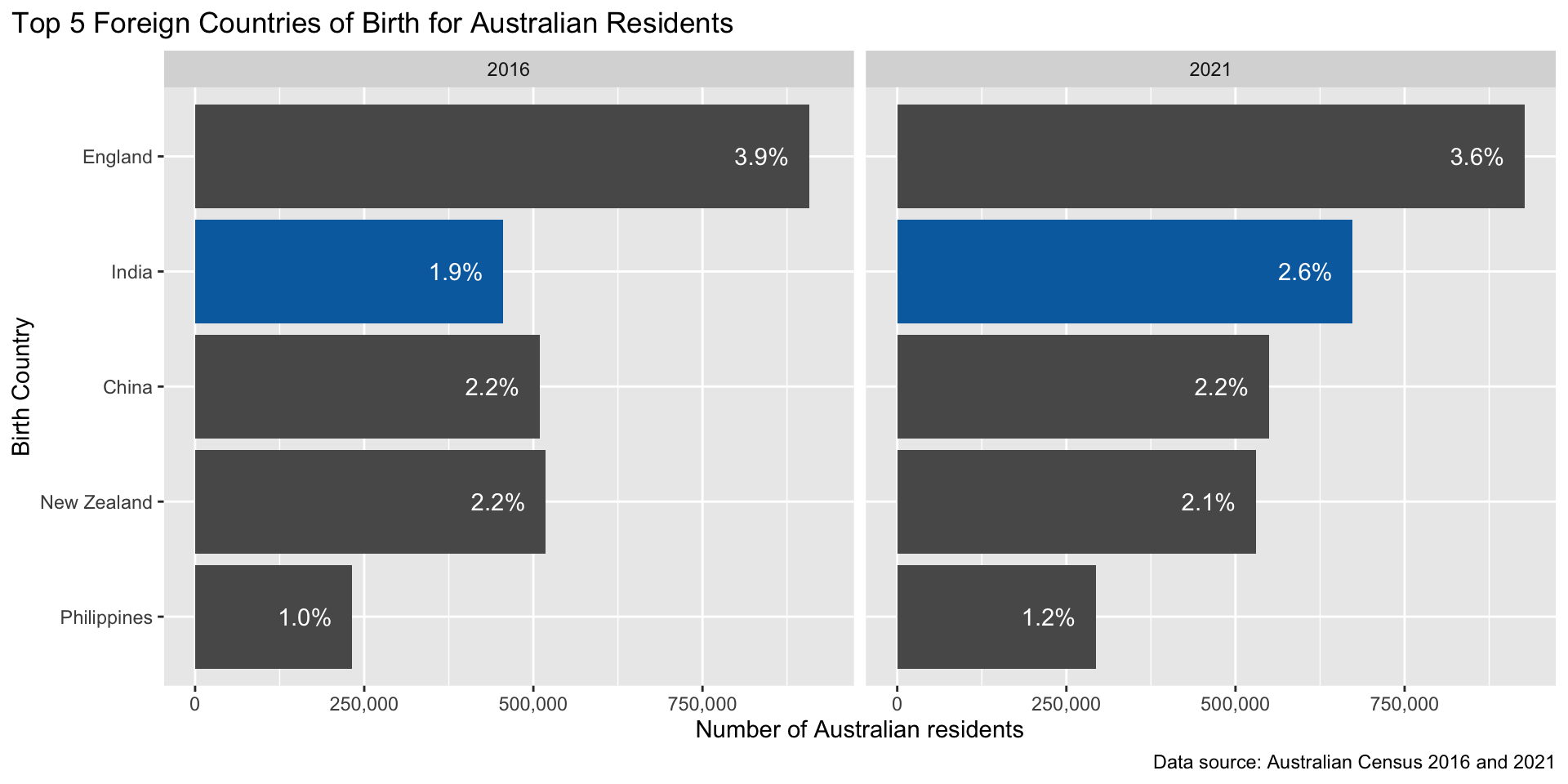
This example is based on Australian Census data from 2016 and 2021.
The data have been filtered to look at the top 5 foreign countries of birth (which are the same across both census years): England, New Zealand, China, India and Philippines:
| 2016 | ||
| Country | Count | % |
|---|---|---|
| England | 907,570 | 3.9 |
| New Zealand | 518,466 | 2.2 |
| China | 509,555 | 2.2 |
| India | 455,389 | 1.9 |
| Philippines | 232,386 | 1.0 |
| 2021 | ||
| Country | Count | % |
|---|---|---|
| England | 927,490 | 3.6 |
| India | 673,352 | 2.6 |
| China | 549,618 | 2.2 |
| New Zealand | 530,492 | 2.1 |
| Philippines | 293,892 | 1.2 |
Top 5 overseas countries of birth, Australian census
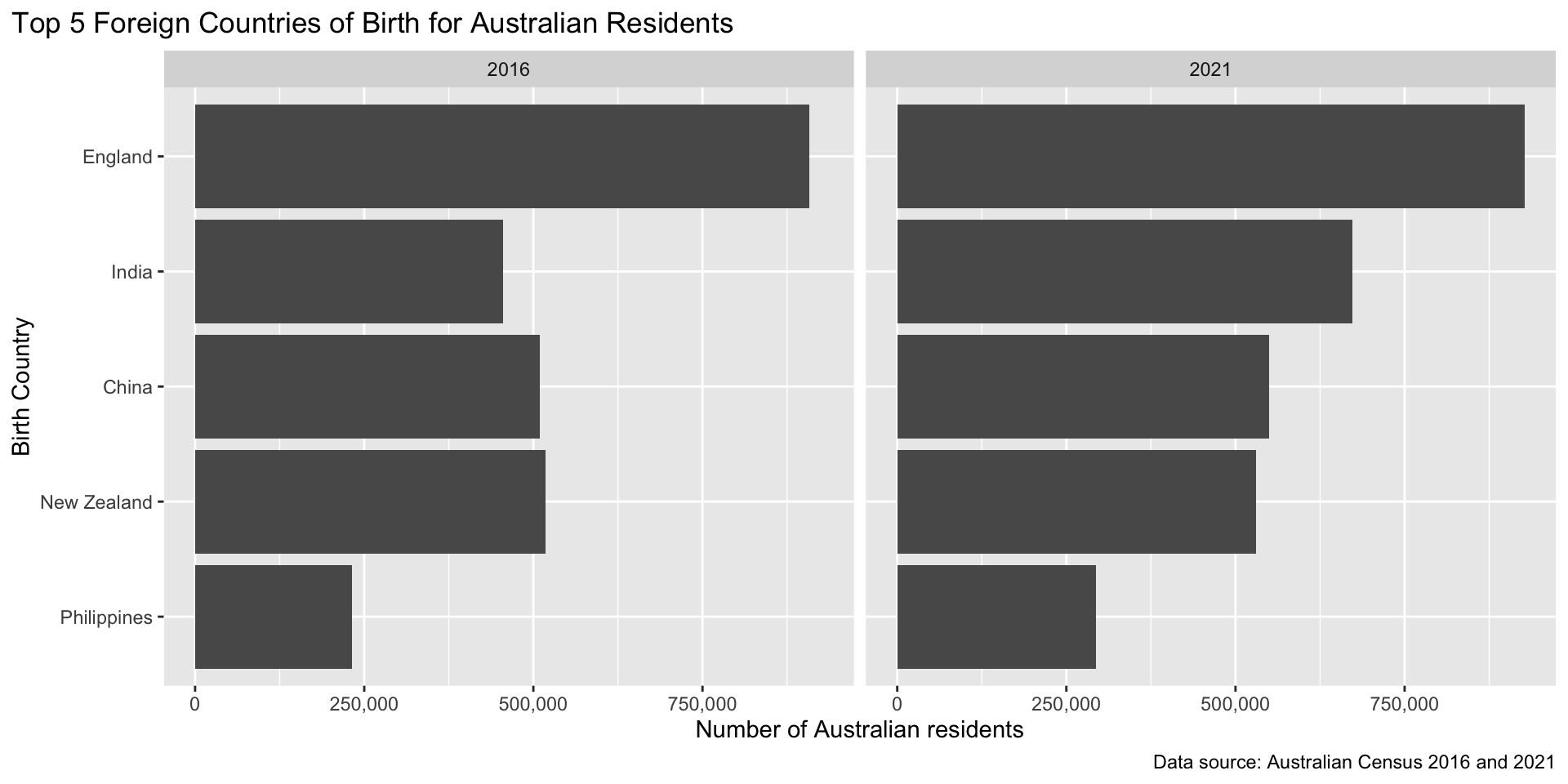
Do you notice a change between 2016-2021?
Matching chart type to messages
Let’s try a different chart type to show our message more clearly.
| Goal | Chart type |
|---|---|
| Compare values across categories | Bar chart (horizontal preferred) |
| Show distribution of one variable | Histogram, density, boxplot, violin |
| Show relationship between two variables | Scatter plot, line chart |
| Show composition or part-of-whole | Stacked bar, treemap |
| Show change over time | Line chart, area chart |
| Show many variables at once | Faceted plots, paired plots |
Custom chart types
Common chart types might not highlight or convey the particular message or information you want. In this case, you might experiment with creating your own hybrid, composite or totally new chart types.
Message: India overtook China and New Zealand
Let’s try a line chart with two time points (2016 and 2021):
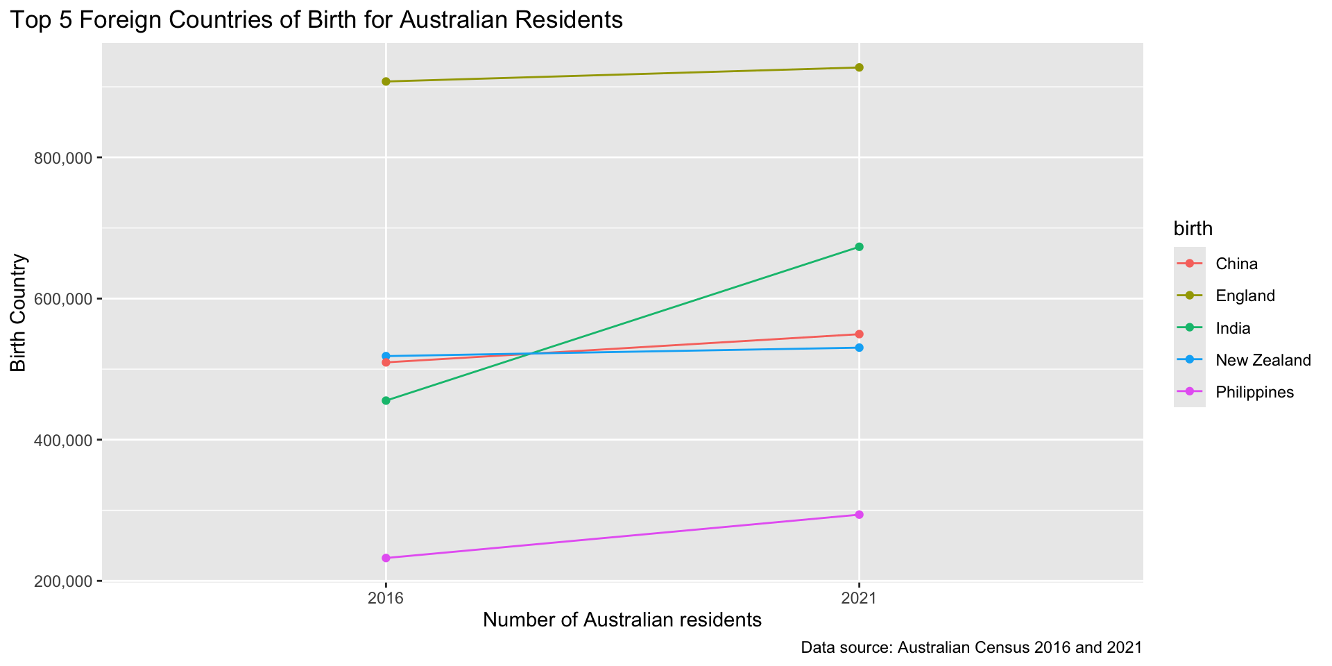
But notice, the legend and line order don’t match…
Can we improve clarity?
Let’s use direct labelling for each country line, and switch to percentages rather than absolute counts.
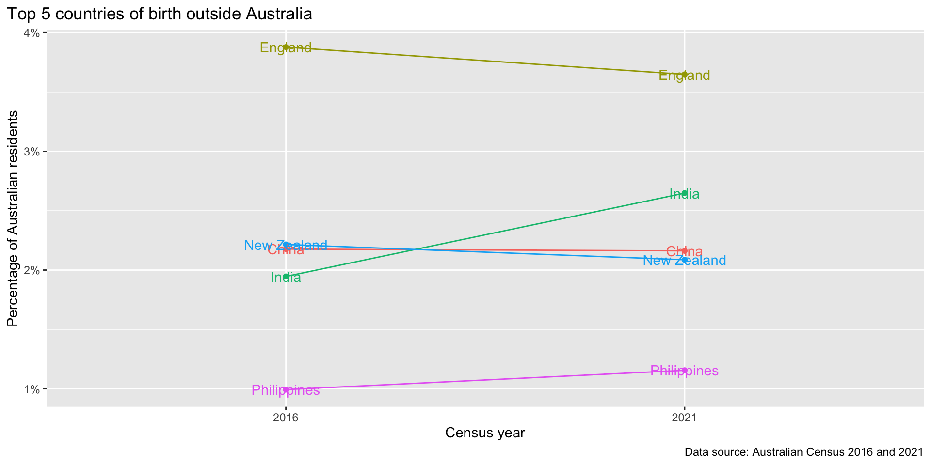
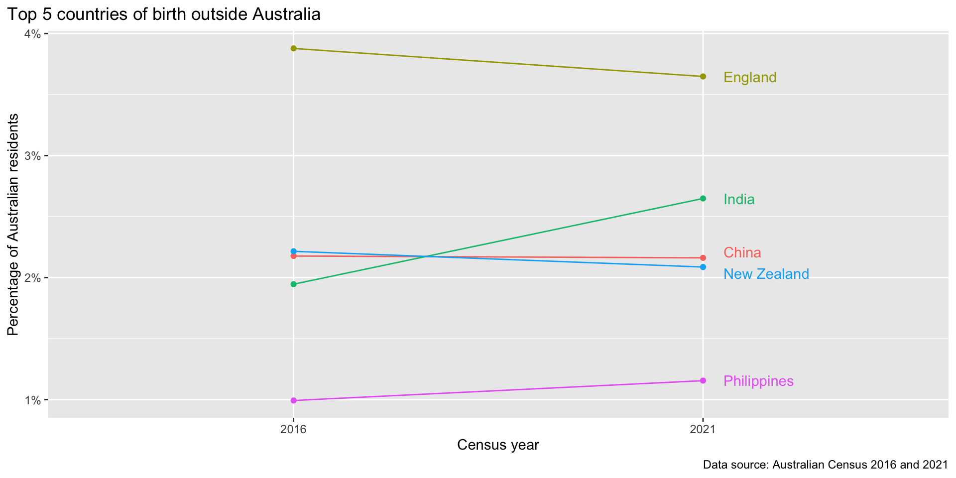
Adjusting labels?
Let’s use data() to only put labels in 2021, and adjust the y positions by modifying the percentage values so the labels don’t overlap.
birth_top5 |>
  arrange(census, birth) |>
  ggplot(aes(x = factor(census), y = percentage / 100, color = birth)) +
  geom_line(aes(group = birth)) +
  geom_point() +
  scale_y_continuous(labels = scales::percent) +
  geom_text(
    aes(label = birth),
    data = ~filter(.x, census == 2021) |>
      mutate(percentage = case_when(
        birth == "China"       ~ percentage + 0.05,
        birth == "New Zealand" ~ percentage - 0.05,
        TRUE                   ~ percentage
      )),
    hjust = 0, nudge_x = 0.05
  ) +
  labs(y = "Percentage of Australian residents", x = "Census year",
       caption = "Data source: Australian Census 2016 and 2021",
       title = "Top 5 countries of birth outside Australia") +
  theme(plot.title.position = "plot", legend.position = "none")
Adjusting labels?
Principles for Visualisation Design
What makes for a good visualisation?
- Are you showing the information needed to support your message? (e.g. statements about counts vs. percentages?)
- Is more important information highlighted visually? (e.g. bar -> line chart in birth place example)
- Are extraneous or distracting information removed or given lower visual priority? (e.g. filtering observations, removing duplicate labels)
- How easily could someone guess the title, subtitle, or caption of your visualisation?
Precision vs. Perception
Similar to the deciding between tables and plots, there are also trade-offs between designing for:
- quick insights and pattern recognition (perception) or
- precise measurements and exact readings (precision).
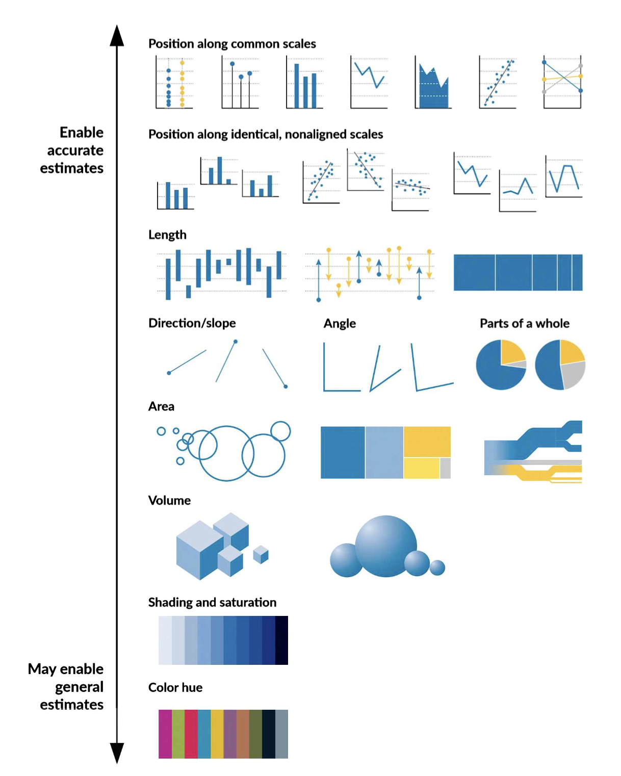
Extension: Perceptual Tasks & Hierarchy
Perceptual tasks are elementary visual operations used to extract information from a chart:
- Position along a common scale
- Length comparison
- Angle estimation
- Area perception
- Colour saturation
Note
We will not cover specifics (that’s a whole separate course). A good starting article for practical advice: https://www.emrecanokten.com/articles/choosing-between-perception-or-precision-data-visualisation
Supporting text for visualisations
Support text helps readers interpret a visualisation without having to infer from data alone:
- Title & subtitle — what the chart shows; subtitle states the finding, not just the axes
- Axis labels — variable name and units; omit if clear from context
- Legend — maps visual encodings (colour, shape) to categories; prefer direct labels when possible
- Annotations & data labels — highlight specific values or observations inline
- Caption — directs viewer to the key takeaways and provides supplementary information (e.g. data source)
- Alt text — a text description for screen readers; convey the message, not just chart structure
Fixed marks with annotate()
annotate() places text, shapes, or arrows at fixed coordinates — not tied to any data row.
library(palmerpenguins)

penguins |>
  ggplot(aes(bill_length_mm, bill_depth_mm,
             colour = species)) +
  geom_point(alpha = 0.5, show.legend = FALSE) +
  annotate("rect",
    xmin = 40, xmax = 60,
    ymin = 12.5, ymax = 17.5,
    alpha = 0.15, fill = "steelblue") +
  annotate("text",
    x = 57, y = 13,
    label = "Gentoo", hjust = 0,
    fontface = "bold") +
  labs(x = "Bill length (mm)",
       y = "Bill depth (mm)")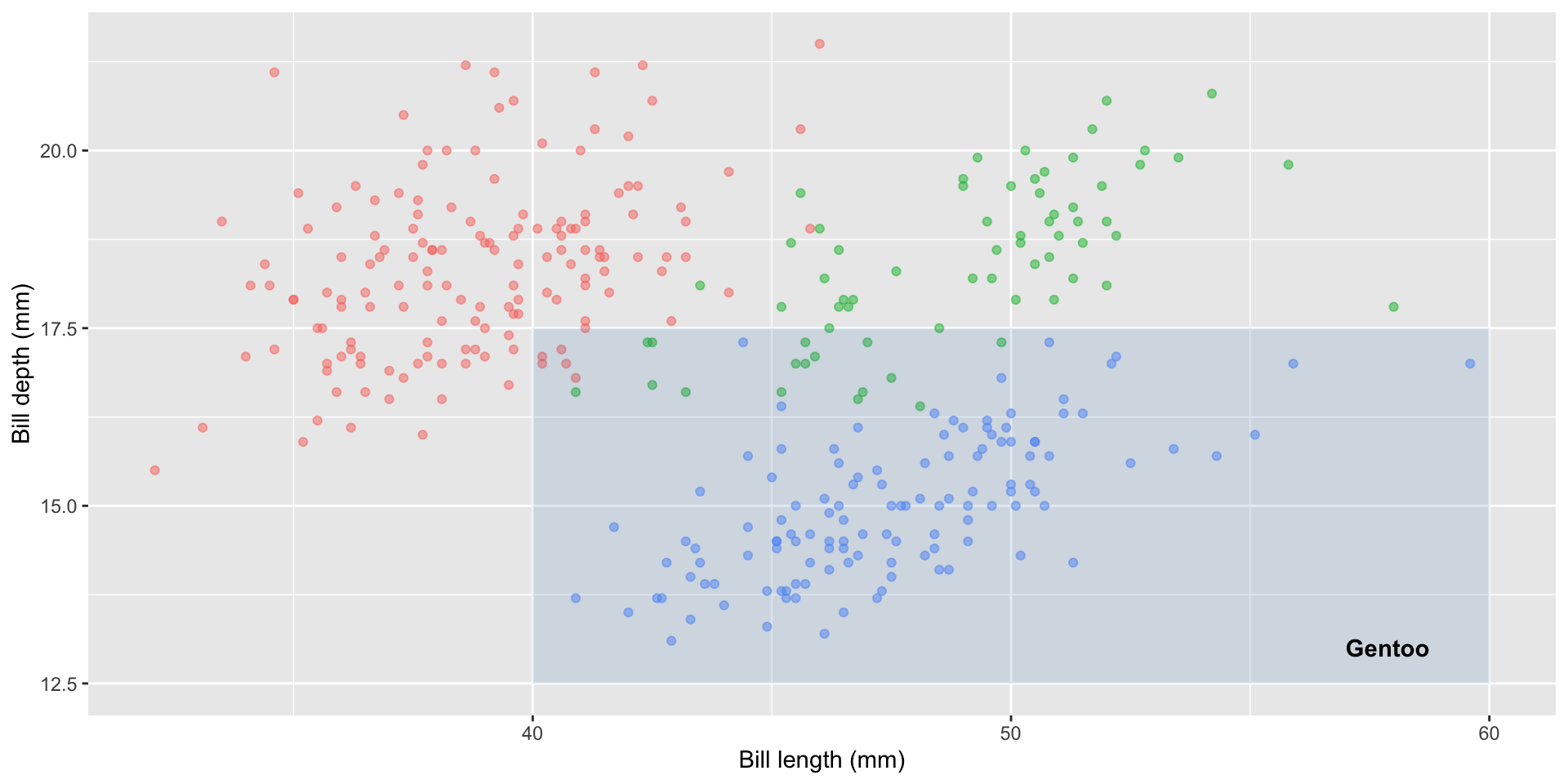
Reference lines
geom_vline() / geom_hline() mark thresholds or events using a data-free layer.
museum_visitors |>
  ggplot(aes(x = jahr, y = wert, color = auspraegung)) +
  geom_line() +
  geom_vline(xintercept = 2020,
    linetype = "dashed", colour = "red") +
  annotate("text",
    x = 2020.3, y = 1000000,
    label = "COVID-19", hjust = 0,
    color = "red") +
  scale_y_continuous(
    labels = scales::label_comma()) +
  labs(x = "Year", y = "Annual visitors",
       title = "Visitors to Munich Museums",
       color = "Museum")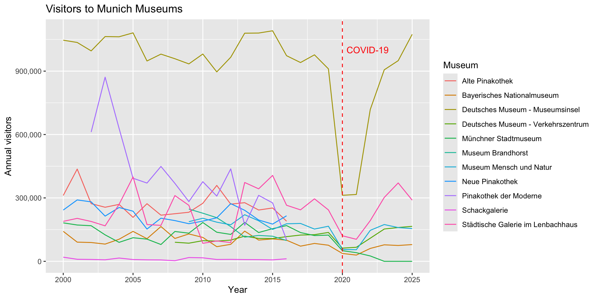
Captions
- Orient immediately — the opening sentence states the subject, variables, and context so readers understand the topic without looking at the axes
- Tell the story, not just the label — state the finding or trend (“Western region outpaced all others by 2023”), not just “Bar chart of sales by region”
- Include the key takeaway — surface the main conclusion; don’t make readers do the interpretive work themselves
- Provide essential context — time period, units, sample size, geographic scope, and important caveats (e.g. “excludes outliers above 99th percentile”)
- Explain non-obvious design choices — note log scales, non-standard encodings, or unusual chart types so readers decode correctly
- Credit the source — include a “Source:” line or footnote for data provenance
- Be concise but complete — two to four sentences; match vocabulary to the audience’s expertise
Alt-Text Principles
- Read the caption first — alt text should complement, not duplicate it: if the caption states the insight, focus alt text on structure; if the caption is generic, include the key insight; together they should give complete understanding
- Always state the chart type — e.g. “A scatter plot of…”; screen readers have no visual context
- Name variables, units, and ranges — axis variables, measurement units, and numerical bounds (e.g. “bill depth (mm), range 13–22”)
- Describe visual encodings — explain colour, size, or shape mappings (e.g. “colour indicates species”)
- Describe observable patterns per group — shape, range, or trend for each category, without adding interpretation beyond what’s visible
- Keep it to 1–3 sentences — be complete but concise; alt text is not a paragraph of prose
Example: Caption & Alt-Text
library(palmerpenguins)
penguins |>
  ggplot(aes(x = bill_depth_mm, y = bill_length_mm,
             color = species)) +
  geom_point() +
  scale_x_continuous(breaks = seq(13, 22, 2)) +
  scale_y_continuous(breaks = seq(30, 60, 10)) +
  labs(
    x = "Bill depth (mm)",
    y = "Bill length (mm)",
    colour = "Species"
  ) +
  theme(aspect.ratio = 1)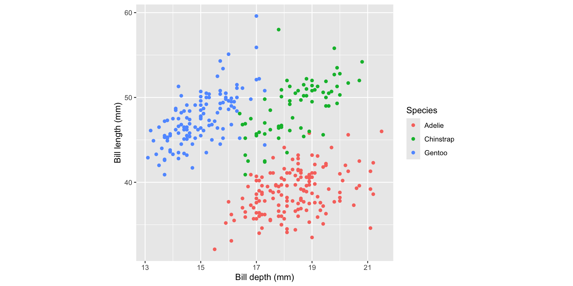
Example: Caption & Alt-Text (cont.)
Caption
Examining the differences in bill sizes of three species of penguins. Colour indicates species. Gentoo bills are smaller in depth but longer. Chinstrap and Adelie bills have similarly large depth but Chinstrap bills are longer.
Caption purpose
Orients sighted readers and states the key takeaway — assumes the reader can see the chart.
Alt text
A scatter plot of penguin bill measurements from the palmerpenguins package. Bill depth (mm) is on the x-axis (range 13–22 mm) and bill length (mm) is on the y-axis (range 30–60 mm). Three species are shown in different colours. Gentoo penguins cluster at low bill depth and high bill length. Adelie penguins cluster at high bill depth and lower bill length. Chinstrap penguins overlap with Adelie in bill length but have similarly large bill depth. All three groups show a positive within-group association between depth and length.
Alt text purpose
Full substitute for the image — conveys all information a sighted reader would perceive, including variable names, units, and per-group patterns.
Note
For more examples see: https://numbats.github.io/alt-text-for-data-plots/example.html
Tools for creating visualisations
Customising ggplot2
- look into ggplot2 documentation
- search for examples online and on GitHub (especially #tidytuesday)
- ask an LLM
- read R Graphics Cookbook by Winston Chang — practical recipes for common customisations
- follow ggplot2 release notes for new features
Choosing extension packages
Pick packages that are widely used and actively maintained (check GitHub activity and CRAN release dates). Prefer CRAN-published packages over GitHub-only ones — CRAN submission checks catch common issues and improve reproducibility.
ggplot2 ecosystem
Composite Plots
Modifying text in ggplot2
library(palmerpenguins)
penguins |>
  ggplot(aes(bill_length_mm, bill_depth_mm, colour = species)) +
  geom_point(alpha = 0.5) +
  theme_minimal() +
  labs(
    title    = "Palmer Station penguins",
    subtitle = "Chinstrap penguins have the longest bills on average",
    x        = "Bill length (mm)",
    y        = "Bill depth (mm)",
    caption  = "Source: Palmer Station LTER / palmerpenguins package",
    colour   = "Species"
  )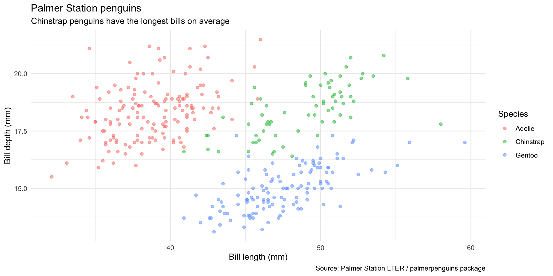
- The subtitle states the finding — not just what the axes show
y = NULLremoves a redundant axis label when the title makes it clear- The caption credits the data source
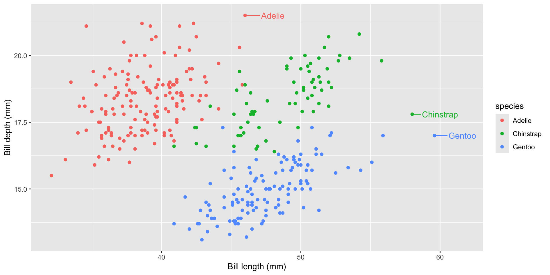
Direct labelling
Replace a legend with labels placed directly on the data:
Direct labelling
Replace a legend with labels placed directly on the data:
library(ggrepel)
library(palmerpenguins)

penguins |>
  ggplot(aes(bill_length_mm, bill_depth_mm, colour = species)) +
  geom_point(show.legend = FALSE) +
  geom_text_repel(
    data = ~slice_max(.x, bill_length_mm, by = species, n = 1),
    aes(label = species),
    nudge_x = 2, show.legend = FALSE
  ) +
  labs(x = "Bill length (mm)", y = "Bill depth (mm)")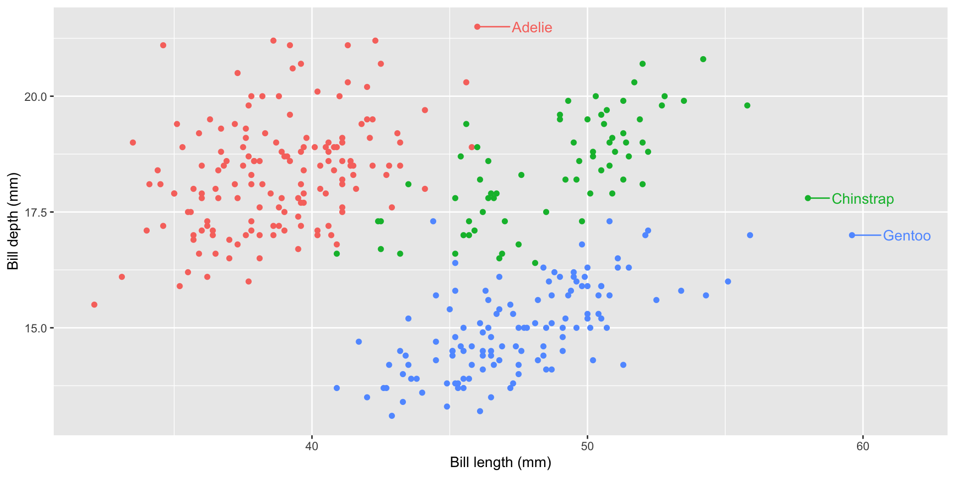
Reduces eye-travel between legend and data — especially useful when there are ≤ 5 groups.
Alt-Text Generation
Set alt text per figure with the fig-alt chunk option:
TIP: Drafting alt text with an LLM
Emil Hvitfeldt shows how to use Claude Code to auto-generate fig-alt for all figures in a Quarto document in one pass.
See: emilhvitfeldt.com/post/claude-code-alt-text-quarto
Remember to always review and adjust the alt text to make sure it matches your message and plot.
Summary
Communicating with Tables
- Choose between tables and plots based on your message and audience – which matter more? pattern or trend or exact values?
- Descriptive summaries can cover: variable list, observation count, missing values, distributions, and correlations
- Model result tables show estimates, uncertainty (SE or CI), and a fit statistics — use
broom::tidy()to get a tidy data frame first - Correlation tables and plots:
{corrr}produces tidy correlation data frames ready to pipe intogt()orrplot() - Cross-tabulations show joint frequency distributions —
count()+pivot_wider()+gt()is the standard pipeline - Combine tables and visualisations when you need both precision and pattern:
formattablecolour tiles are one lightweight option
Making tables with {gt}
- The
gtworkflow: wrangle first, thengt(), then stack formatting (fmt_*), column (cols_*), and annotation (tab_*) layers - Column labels should carry units (
mm,g,%) — keep cells clean withcols_label()andhtml()/md()helpers tab_spanner()groups related columns under a shared header- Right-align numbers, left-align text; choose decimal places to match the precision that matters to your reader
- Every table should have a title and a source note;
- Captions should state the take-away, not just repeat the title
- Alt text for tables is set via
tbl-capin Quarto — write what a screen reader needs to understand the finding
Communicating with Visualisation
- Start with intent!
- what relationship do you want to show?
- who is the audience?
- Iterative improvement
- start with a default chart, then adjust encodings, labels, and scale to foreground the message
- does your chart match your message?
- consider perceptual tasks and hierarchy as a guide
- Supporting text
- The subtitle should state the finding, not just repeat the axes; the caption credits the data source
- Alt text (
fig-altchunk option) conveys the chart’s message — not its structure — for screen readers
References
Cairo, Alberto. 2016. The Truthful Art: Data, Charts, and Maps for Communication. 1st ed. Indianapolis: New Riders.
Cleveland, William S., and Robert McGill. 1984. “Graphical Perception: Theory, Experimentation, and Application to the Development of Graphical Methods.” Journal of the American Statistical Association 79 (387): 531–54. https://doi.org/10.1080/01621459.1984.10478080.
Heer, Jeffrey, and Michael Bostock. 2010. “Crowdsourcing Graphical Perception: Using Mechanical Turk to Assess Visualization Design.” In Proceedings of the SIGCHI Conference on Human Factors in Computing Systems, 203–12. Atlanta Georgia USA: ACM. https://doi.org/10.1145/1753326.1753357.