StatProg2
  • Home
  • Syllabus
  • Group Project
  • Reflection Prompts
  • Setup

On this page

  • Quiz
  • Overview
  • Part 1: Sandbox
    • Exercise 1.1: Make a ggplot interactive
    • Exercise 1.2: A geom_sf() choropleth
    • Exercise 1.3: The same map, interactive
  • Part 2: Your project — one interactive view
    • Exercise 2.1: Turn an existing plot interactive
    • Exercise 2.2: Do you have spatial data?
    • Exercise 2.3: Share one view
  • Reflection log
    • End-of-practical checklist
  • Resources

Practical #11

Advanced Statistical Programming using R — Interactive Data Storytelling

Author

Leonhard Kestel, Lisa Bondo Andersen, Cynthia Huang

Published

July 3, 2026

Quiz

Before starting, work through this QUIZ to check your understanding of this week’s lecture on interactive and geospatial visualisation.


Overview

Yesterday you saw how to turn a static figure into something a reader can explore — ggplotly() and plotly, leaflet maps, and geospatial plots with geom_sf() and {geofacet}. Today you try them out, then bring one interactive view into your own project.

Part 1 is a short sandbox on palmerpenguins and the built-in North Carolina shapefile, with solutions. Part 2 is the real thing: make one plot from your project interactive and commit it.

Budget roughly 2 hours: about 40 minutes on the sandbox and the rest on your own project.

Note

You will need plotly, leaflet, sf and spData. Install them inside your project (so renv records them) and snapshot afterwards:

install.packages(c("plotly", "leaflet", "sf", "spData"))
renv::snapshot()   # run in the R console

Part 1: Sandbox

~40 min

library(dplyr)
library(ggplot2)
library(plotly)
library(leaflet)
library(sf)
library(spData)   # provides the `world` map

Exercise 1.1: Make a ggplot interactive

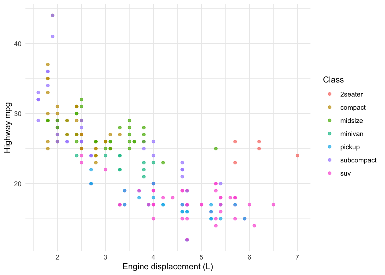
mpg (built into {ggplot2}) records fuel economy for 234 cars. Here is a static scatter — engine size against highway mileage. Wrap it in ggplotly() so readers can hover, zoom, and toggle classes in the legend.

ggplot(mpg, aes(displ, hwy, colour = class)) +
  geom_point(alpha = 0.7) +
  labs(x = "Engine displacement (L)", y = "Highway mpg", colour = "Class") +
  theme_minimal()
Then add the car model to the hover tooltip without drawing it on the plot, and restrict the tooltip to the fields you care about.

NoteSolution
p <- ggplot(mpg, aes(displ, hwy, colour = class,
                     text = paste(manufacturer, model))) +
  geom_point(alpha = 0.7) +
  labs(x = "Engine displacement (L)", y = "Highway mpg", colour = "Class") +
  theme_minimal()

ggplotly(p, tooltip = c("text", "x", "y", "colour"))

The text aesthetic is never rendered in the static plot — ggplotly() only uses it for the tooltip. tooltip = controls which fields show on hover; without it, every aesthetic appears. Click a class in the legend to hide it, double-click to isolate.

Exercise 1.2: A geom_sf() choropleth

{spData} ships world, an sf object of country boundaries with a few indicators. Map lifeExp (life expectancy) to fill colour.

data(world)
NoteSolution
ggplot(world) +
  geom_sf(aes(fill = lifeExp)) +
  scale_fill_viridis_c(name = "Life\nexpectancy") +
  labs(title = "Life expectancy by country") +
  theme_void()
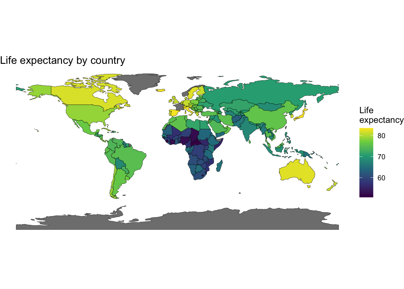
An sf object is just a data frame with a geometry column, so aes(fill = ...) works like any other chart. theme_void() drops axes and grid — right for maps. geom_sf() handles the projection for you.

Exercise 1.3: The same map, interactive

Turn the choropleth into a leaflet map: a background layer, country polygons filled by lifeExp, a country-name label on hover, and a legend.

NoteSolution
pal <- colorNumeric("viridis", domain = world$lifeExp)

leaflet(world) |>
  addTiles() |>
  addPolygons(fillColor = ~pal(lifeExp), fillOpacity = 0.7,
              weight = 1, color = "white", label = ~name_long) |>
  addLegend(pal = pal, values = ~lifeExp,
            title = "Life expectancy", position = "bottomright")

Build the map layer by layer: addTiles() for the background, addPolygons() for the filled shapes, addLegend() for the colour key. colorNumeric() is reused by both the polygons and the legend so they stay in sync. leaflet reprojects the sf object to WGS84 automatically.


Part 2: Your project — one interactive view

~70 min

By the end you should have one interactive plot committed to your project repo.

Exercise 2.1: Turn an existing plot interactive

Pick a ggplot2 figure you already have and wrap it in ggplotly(). Add a text aesthetic so the hover tooltip shows a useful label (an ID, a place name, a category), and restrict the tooltip with tooltip =.

TipWhen interactivity earns its place

Interactivity is not free — it only helps when the reader has something to explore. Good fits: a dense scatter where hover reveals individual cases, many overlapping groups the reader can toggle, or a map they can pan and zoom. If your figure makes a single point, a clean static plot from last week is often the better choice.

Exercise 2.2: Do you have spatial data?

If any of your data has a location — coordinates, place names, regions — map it.

  • Coordinates or place names → leaflet. No coordinates? Geocode place names with tidygeocoder::geocode(address, method = "osm") (free, no API key) to get lat/long.
  • Region boundaries → geom_sf() (static) or addPolygons() (interactive), joining your data to an sf object by region name.

No spatial data? Skip this and instead add a second interaction to your Ex 2.1 plot — box-/lasso-select via highlight_key(), or a plot_ly() box plot of a distribution.

Exercise 2.3: Share one view

Embed the interactive plot in a Quarto page in your project so it renders in the browser, and add a one-sentence caption stating what a reader can now discover by exploring it. Then commit.

Important

Interactive widgets only work in HTML output — they will not render in PDF or Word. Make sure the page hosting them uses format: html.

TipOral exam tip

Be ready to justify the choice: “I made this interactive because readers wanted to look up individual points” is a design decision linked to a reason — exactly what we look for. “I made it interactive because I could” is not.


Reflection log

~10 min

Take a few minutes to add this week’s entry to your reflection log. The new interactive plot and the reflection log entry can go in one commit.


End-of-practical checklist

Before you leave today, make sure your group has:


Resources

  • htmlwidgets for R — the ecosystem behind plotly, leaflet, DT
  • Interactive web-based visualisation with plotly (Sievert) — the plotly reference
  • Leaflet for R — building maps layer by layer
  • Simple Features (sf) and geom_sf() — geospatial data in R
  • Quarto interactivity (OJS) — reactive views without a Shiny server
Source Code
---
title: "Practical #11"
subtitle: "Advanced Statistical Programming using R — Interactive Data Storytelling"
author: "Leonhard Kestel, Lisa Bondo Andersen, Cynthia Huang"
date: "July 3, 2026"
format:
  html:
    theme: default
    toc: true
    toc-depth: 2
    code-tools: true
    highlight-style: github
execute:
  eval: true
  message: false
  warning: false
---

# Quiz

Before starting, work through this [QUIZ](quiz.qmd){target="_blank"} to check your understanding of this week's lecture on interactive and geospatial visualisation.

---

# Overview

Yesterday you saw how to turn a static figure into something a reader can explore —
`ggplotly()` and `plotly`, `leaflet` maps, and geospatial plots with `geom_sf()` and
`{geofacet}`. Today you try them out, then bring one interactive view into your own
project.

**Part 1** is a short sandbox on `palmerpenguins` and the built-in North Carolina
shapefile, with solutions. **Part 2** is the real thing: make one plot from your
project interactive and commit it.

Budget roughly **2 hours**: about 40 minutes on the sandbox and the rest on your own
project.

::: {.callout-note}
You will need `plotly`, `leaflet`, `sf` and `spData`. Install them inside your
project (so `renv` records them) and snapshot afterwards:

```r
install.packages(c("plotly", "leaflet", "sf", "spData"))
renv::snapshot()   # run in the R console
```
:::

---

# Part 1: Sandbox
*~40 min*

```{r}
library(dplyr)
library(ggplot2)
library(plotly)
library(leaflet)
library(sf)
library(spData)   # provides the `world` map
```

## Exercise 1.1: Make a ggplot interactive

`mpg` (built into `{ggplot2}`) records fuel economy for 234 cars. Here is a static
scatter — engine size against highway mileage. Wrap it in `ggplotly()` so readers can
hover, zoom, and toggle classes in the legend.

```{r}
ggplot(mpg, aes(displ, hwy, colour = class)) +
  geom_point(alpha = 0.7) +
  labs(x = "Engine displacement (L)", y = "Highway mpg", colour = "Class") +
  theme_minimal()
```

Then add the **car model** to the hover tooltip without drawing it on the plot, and
restrict the tooltip to the fields you care about.

::: {.callout-note title="Solution" collapse="true"}
```{r}
p <- ggplot(mpg, aes(displ, hwy, colour = class,
                     text = paste(manufacturer, model))) +
  geom_point(alpha = 0.7) +
  labs(x = "Engine displacement (L)", y = "Highway mpg", colour = "Class") +
  theme_minimal()

ggplotly(p, tooltip = c("text", "x", "y", "colour"))
```

The `text` aesthetic is never rendered in the static plot — `ggplotly()` only uses it
for the tooltip. `tooltip =` controls which fields show on hover; without it, every
aesthetic appears. Click a class in the legend to hide it, double-click to isolate.
:::

## Exercise 1.2: A `geom_sf()` choropleth

`{spData}` ships `world`, an `sf` object of country boundaries with a few indicators.
Map `lifeExp` (life expectancy) to fill colour.

```{r}
data(world)
```

::: {.callout-note title="Solution" collapse="true"}
```{r}
ggplot(world) +
  geom_sf(aes(fill = lifeExp)) +
  scale_fill_viridis_c(name = "Life\nexpectancy") +
  labs(title = "Life expectancy by country") +
  theme_void()
```

An `sf` object is just a data frame with a `geom`etry column, so `aes(fill = ...)`
works like any other chart. `theme_void()` drops axes and grid — right for maps.
`geom_sf()` handles the projection for you.
:::

## Exercise 1.3: The same map, interactive

Turn the choropleth into a `leaflet` map: a background layer, country polygons filled
by `lifeExp`, a country-name label on hover, and a legend.

::: {.callout-note title="Solution" collapse="true"}
```{r}
pal <- colorNumeric("viridis", domain = world$lifeExp)

leaflet(world) |>
  addTiles() |>
  addPolygons(fillColor = ~pal(lifeExp), fillOpacity = 0.7,
              weight = 1, color = "white", label = ~name_long) |>
  addLegend(pal = pal, values = ~lifeExp,
            title = "Life expectancy", position = "bottomright")
```

Build the map layer by layer: `addTiles()` for the background, `addPolygons()` for the
filled shapes, `addLegend()` for the colour key. `colorNumeric()` is reused by both the
polygons and the legend so they stay in sync. leaflet reprojects the `sf` object to
WGS84 automatically.
:::

---

# Part 2: Your project — one interactive view
*~70 min*

By the end you should have **one interactive plot** committed to your project repo.

## Exercise 2.1: Turn an existing plot interactive

Pick a `ggplot2` figure you already have and wrap it in `ggplotly()`. Add a `text`
aesthetic so the hover tooltip shows a useful label (an ID, a place name, a category),
and restrict the tooltip with `tooltip =`.

::: {.callout-tip title="When interactivity earns its place" collapse="true"}
Interactivity is not free — it only helps when the reader has something to explore.
Good fits: a dense scatter where hover reveals individual cases, many overlapping
groups the reader can toggle, or a map they can pan and zoom. If your figure makes a
single point, a clean static plot from last week is often the better choice.
:::

## Exercise 2.2: Do you have spatial data?

If any of your data has a location — coordinates, place names, regions — map it.

- **Coordinates or place names → `leaflet`.** No coordinates? Geocode place names with
  `tidygeocoder::geocode(address, method = "osm")` (free, no API key) to get `lat`/`long`.
- **Region boundaries → `geom_sf()`** (static) or `addPolygons()` (interactive), joining
  your data to an `sf` object by region name.

No spatial data? Skip this and instead add a second interaction to your Ex 2.1 plot —
box-/lasso-select via `highlight_key()`, or a `plot_ly()` box plot of a distribution.

## Exercise 2.3: Share one view

Embed the interactive plot in a Quarto page in your project so it renders in the
browser, and add a one-sentence caption stating what a reader can now discover by
exploring it. Then commit.

::: {.callout-important}
Interactive widgets only work in **HTML** output — they will not render in PDF or Word.
Make sure the page hosting them uses `format: html`.
:::

::: {.callout-tip}
## Oral exam tip
Be ready to justify the choice: "I made this interactive because readers wanted to
look up individual points" is a design decision linked to a reason — exactly what we
look for. "I made it interactive because I could" is not.
:::

---

# Reflection log
*~10 min*

Take a few minutes to add this week's entry to your
[reflection log](_reflection-prompts.qmd). The new interactive plot and the reflection
log entry can go in one commit.

---

## End-of-practical checklist

Before you leave today, make sure your group has:

- [ ] One project `ggplot2` figure turned interactive with `ggplotly()`
- [ ] Decided whether your data is spatial, and mapped it if so
- [ ] The interactive view embedded in an HTML Quarto page with a caption
- [ ] This week's reflection log entry committed and pushed

---

# Resources

- [htmlwidgets for R](https://www.htmlwidgets.org/) — the ecosystem behind `plotly`, `leaflet`, `DT`
- [Interactive web-based visualisation with plotly](https://plotly-r.com/) (Sievert) — the plotly reference
- [Leaflet for R](https://rstudio.github.io/leaflet/) — building maps layer by layer
- [Simple Features (`sf`)](https://r-spatial.github.io/sf/) and [`geom_sf()`](https://ggplot2.tidyverse.org/reference/ggsf.html) — geospatial data in R
- [Quarto interactivity (OJS)](https://quarto.org/docs/interactive/ojs/) — reactive views without a Shiny server