Advanced Statistical Programming using R
Week 12: Interactive Data Storytelling
2026-07-02
Announcements
Today’s Special
Prepare pen and paper! We are going to draw today…
Upcoming deadlines
- Progress Update due Jun 29 — hope you submitted!
- We will provide group-specific feedback via Moodle this week
- Final submission due 22 Jul
- URL to final website/webpage +
group-reflection.qmd
- URL to final website/webpage +
- Individual contribution statement due 23 Jul (PDF via Moodle)
- Oral exam: 29 Jul
This week
- Project feedback
- Interactive visualisation in R
- The htmlwidgets ecosystem
- Quarto interactivity with OJS
- Geospatial visualisation:
{geofacet}&{geom_sf}
Project Feedback
- released on Moodle
- you don’t need to fix everything!
- but definitely do your group & individual reflections
- you should UNDERSTAND the feedback.
Last Week
Syllabus
Part 1: Statistical Programming Foundations
- W02: Scripts, Functions & Refactoring
- W03: Debugging
- W04: Version Control & Remotes
- W05: Quarto Websites & Collaborative Coding
- W06: R Packages
Part 2: Working with Real World Data
- W07: Initial Data Analysis & Data Cleaning
- W09: Reproducibility, Open Data & renv
- W10: Analysis & Inference
- W11: Statistical Communication & Visualisation
Part 3: Advanced Topics & Summary
- W12: Interactive Data Storytelling
- W13: Multi-lingual Analysis (Python/R)
- W14: Review & Outro
Communicating with Tables
- Choose between tables and plots based on your message and audience – which matter more? pattern or trend or exact values?
- Descriptive summaries can cover: variable list, observation count, missing values, distributions, and correlations
- Model result tables show estimates, uncertainty (SE or CI), and a fit statistics — use
broom::tidy()to get a tidy data frame first - Correlation tables and plots:
{corrr}produces tidy correlation data frames ready to pipe intogt()orrplot() - Cross-tabulations show joint frequency distributions —
count()+pivot_wider()+gt()is the standard pipeline - Combine tables and visualisations when you need both precision and pattern:
formattablecolour tiles are one lightweight option
Making tables with {gt}
- The
gtworkflow: wrangle first, thengt(), then stack formatting (fmt_*), column (cols_*), and annotation (tab_*) layers - Column labels should carry units (
mm,g,%) — keep cells clean withcols_label()andhtml()/md()helpers tab_spanner()groups related columns under a shared header- Right-align numbers, left-align text; choose decimal places to match the precision that matters to your reader
- Every table should have a title and a source note;
- Captions should state the take-away, not just repeat the title
- Alt text for tables is set via
tbl-capin Quarto — write what a screen reader needs to understand the finding
Communicating with Visualisation
- Start with intent!
- what relationship do you want to show?
- who is the audience?
- Iterative improvement
- start with a default chart, then adjust encodings, labels, and scale to foreground the message
- does your chart match your message?
- consider perceptual tasks and hierarchy as a guide
- Supporting text
- The subtitle should state the finding, not just repeat the axes; the caption credits the data source
- Alt text (
fig-altchunk option) conveys the chart’s message — not its structure — for screen readers
{gt} in one example
Wrangle first, then stack fmt_* / cols_* / tab_* layers:
library(dplyr)

penguins |>
  group_by(species) |>
  summarise(
    n    = n(),
    bill = mean(bill_length_mm, na.rm = TRUE),
    mass = mean(body_mass_g, na.rm = TRUE)
  ) |>
  gt() |>
  tab_header(title = "Penguin size by species") |>
  tab_spanner(label = "Mean", columns = c(bill, mass)) |>
  cols_label(
    species = "Species", n = "N",
    bill = html("Bill length<br>(mm)"),
    mass = html("Body mass<br>(g)")
  ) |>
  fmt_number(columns = c(bill, mass), decimals = 1) |>
  cols_align(align = "right", columns = c(n, bill, mass)) |>
tab_source_note("Source: palmerpenguins")| Penguin size by species | |||
| Species | N |
Mean
|
|
|---|---|---|---|
| Bill length (mm) |
Body mass (g) |
||
| Adelie | 152 | 38.8 | 3,700.7 |
| Chinstrap | 68 | 48.8 | 3,733.1 |
| Gentoo | 124 | 47.5 | 5,076.0 |
| Source: palmerpenguins | |||
Iterative improvement: before → after
Start with the default, then adjust encodings, labels, and scale to foreground the message:
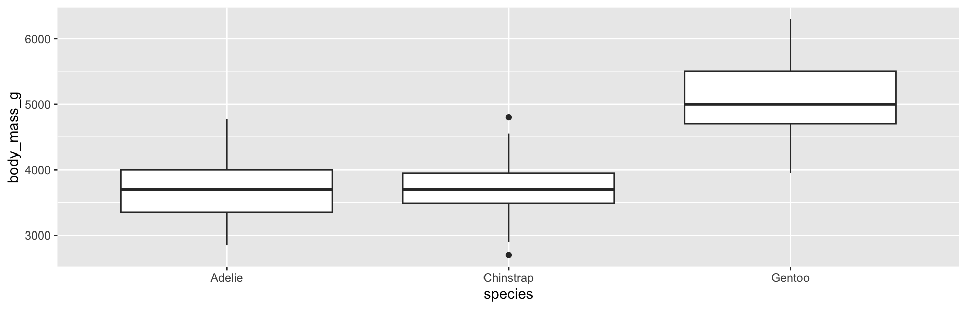
Before — ggplot defaults
After — ordered, titled, message first
ggplot(penguins,
       aes(reorder(species, body_mass_g,
                   FUN = \(x) median(x, na.rm = TRUE)),
           body_mass_g, fill = species)) +
  geom_boxplot(show.legend = FALSE) +
  coord_flip() +
  labs(title = "Gentoo penguins are the heaviest",
       subtitle = "Body mass distribution by species",
       x = NULL, y = "Body mass (g)",
       caption = "Source: palmerpenguins") +
  theme_minimal()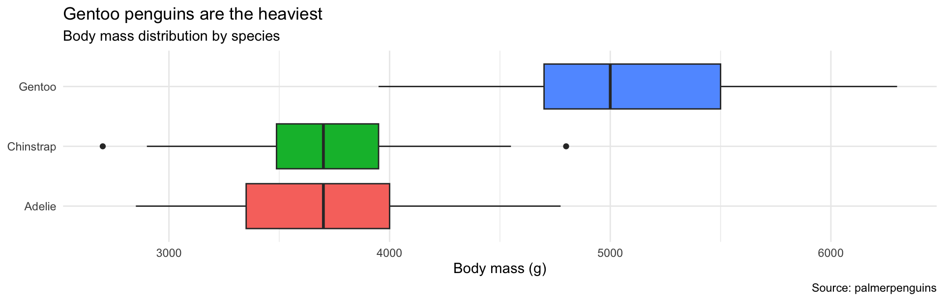
Interactive Visualisation
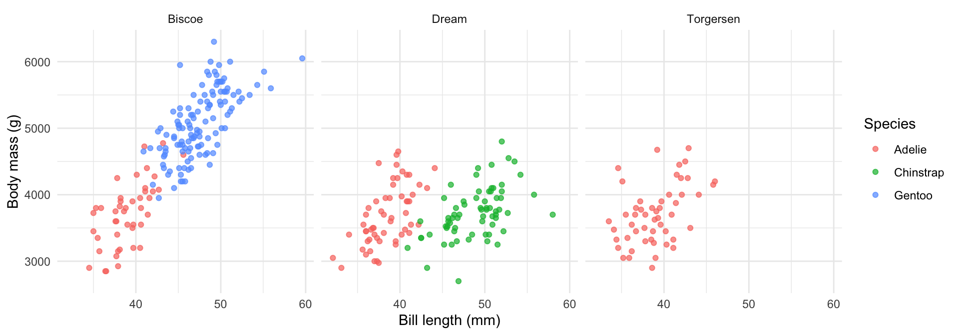
A static faceted plot
A familiar ggplot2 figure — one panel per island:
…the same plot, interactive
Drop the facets, map island to shape so it joins the legend — then hover, zoom, and click to filter:
Why interactive?
- Static plots communicate a single, pre-chosen view
- Interactive plots let readers explore the data themselves
- Useful for:
- dashboards and reports consumed in a browser
- large datasets where you can’t show everything at once
- guiding a reader through multiple related views
- Tradeoff: you gain flexibility but lose control over what the reader actually sees
What’s possible — interactive charts
Examples made entirely in R:
- EURO 2024 Final — scrollytelling analysis — Closeread + ggplot2 + ggiraph (Grand Prize, Closeread contest)
- Which way do you ski? — Closeread with custom ski-rose charts (Best technical)
- World Population Flags — OJS + flag visualisation (Best visual polish)
- Vienna housing inequality — evolving maps as you scroll (Best scrollytelling)
- A gem of my childhood — map pan & zoom storytelling (Best map)
- OJS penguins dashboard — reactive filters, linked views
The R interactive vis landscape
| Approach | Package | Output |
|---|---|---|
| htmlwidgets | plotly |
Any HTML output |
| htmlwidgets | leaflet |
Any HTML output |
| htmlwidgets | DT |
Any HTML output |
| htmlwidgets | dygraphs |
Any HTML output |
| Quarto / OJS | Observable JS | Quarto HTML |
| Shiny | shiny |
Shiny app / server |
Tip
- htmlwidgets are the easiest entry point — no server, work in any HTML output
- Shiny is the most powerful — but needs a running R server to serve the app
htmlwidgets
- An htmlwidget is an R package that wraps a JavaScript visualisation library
- You call R functions; the widget renders in the browser
- Works in: Quarto HTML, R Markdown, Shiny, RStudio viewer
Tip
ggplotly() converts an existing ggplot2 plot to interactive with one function call — the quickest upgrade path.
Example: ggplotly()
Source: plotly R open source graphing library
Example: plot_ly() box plot
Source: plotly R open source graphing library
Example: hide/show groups via the legend
Source: plotly R open source graphing library
Example: box- / lasso-select
Source: plotly R — client-side linking
{plotly} — key interactions
- Hover tooltips — show values on mouse-over (customise with
tooltip =) - Click to hide/show groups in the legend
- Box-select / lasso-select — highlight subsets
- Zoom and pan — built in by default
- Linked views — multiple charts can share a selection via
{crosstalk}
Example: {leaflet} interactive map
Source: Leaflet for R
Finding coordinates with {tidygeocoder}
If you have place names, you don’t need to look up coordinates manually:
# A tibble: 3 × 3
  address                              lat  long
  <chr>                              <dbl> <dbl>
1 Geschwister-Scholl-Platz 1, Munich  48.2  11.6
2 Ludwigstraße 28, Munich             48.2  11.6
3 Marchioninistraße 15, Munich        48.1  11.5
Tip
method = "osm" uses OpenStreetMap’s geocoder — free, no API key needed. Returns a data frame with lat and long columns ready to pass to leaflet().
{leaflet} — building up a map
Each add*() call adds a new layer on top:
addTiles()— the background map (OpenStreetMap by default). Without this you get a blank grey canvas.addMarkers()/addCircleMarkers()— pins on the map. Each marker needs a lat, lng, and optionally a popup label.addPolygons()— filled shapes, e.g. country or county boundaries coloured by a variable (likegeom_sf()but interactive)addLegend()— colour legend, needed when you use fill colour to encode a variableaddLayersControl()— a toggle UI letting the reader switch between different data layers
Example: all the layers together
Source: Leaflet for R
nc <- sf::st_read(system.file("shape/nc.shp", package = "sf"), quiet = TRUE)
pal <- colorNumeric("viridis", domain = nc$BIR74)

cities <- data.frame(
  name = c("Charlotte", "Raleigh", "Asheville"),
  lng  = c(-80.843, -78.639, -82.554),
  lat  = c( 35.227,  35.780,  35.595)
)

leaflet() |>
  addTiles() |>                                             # background map
  addPolygons(data = nc, fillColor = ~pal(BIR74),           # filled shapes
              fillOpacity = 0.7, weight = 1, color = "white",
              label = ~NAME, group = "Counties") |>
  addCircleMarkers(data = cities, lng = ~lng, lat = ~lat,   # pins
                   radius = 5, color = "red", popup = ~name,
                   group = "Cities") |>
  addLegend(data = nc, pal = pal, values = ~BIR74,          # colour legend
            title = "Births 1974", position = "bottomright") |>
  addLayersControl(overlayGroups = c("Counties", "Cities"), # toggle UI
                   options = layersControlOptions(collapsed = FALSE))
BONUS: Observable JS (OJS) in Quarto
Quarto supports Observable JS natively — reactive code that runs in the browser. Pass R data to OJS with ojs_define():
Then use it in an OJS cell:
```{ojs}
viewof bill_min = Inputs.range([32, 50], {value: 35, step: 1, label: "Min bill length (mm):"})
viewof islands  = Inputs.checkbox(["Torgersen","Biscoe","Dream"],
                    {value: ["Torgersen","Biscoe","Dream"], label: "Island:"})

filtered = transpose(penguins_ojs)
  .filter(d => d.bill_length_mm >= bill_min && islands.includes(d.island))

Plot.dot(filtered, {x: "bill_length_mm", y: "body_mass_g",
                    fill: "species", tip: true}).plot()
```
Tip
Source: Quarto OJS — penguins example. No server needed — OJS runs entirely in the browser.
Geospatial Visualisation
Geospatial data in R
- Most geospatial data comes as shapefiles (
.shp) or GeoJSON - The
{sf}package (Simple Features) is the standard way to work with these in R - An
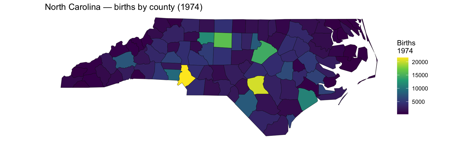
sfobject is just a data frame with a specialgeometrycolumn {ggplot2}natively supportssfobjects viageom_sf()
Geospatial data example: North Carolina counties
Simple feature collection with 6 features and 14 fields
Geometry type: MULTIPOLYGON
Dimension:     XY
Bounding box:  xmin: -81.74107 ymin: 36.07282 xmax: -75.77316 ymax: 36.58965
Geodetic CRS:  NAD27
   AREA PERIMETER CNTY_ CNTY_ID        NAME  FIPS FIPSNO CRESS_ID BIR74 SID74
1 0.114     1.442  1825    1825        Ashe 37009  37009        5  1091     1
2 0.061     1.231  1827    1827   Alleghany 37005  37005        3   487     0
3 0.143     1.630  1828    1828       Surry 37171  37171       86  3188     5
4 0.070     2.968  1831    1831   Currituck 37053  37053       27   508     1
5 0.153     2.206  1832    1832 Northampton 37131  37131       66  1421     9
6 0.097     1.670  1833    1833    Hertford 37091  37091       46  1452     7
  NWBIR74 BIR79 SID79 NWBIR79                       geometry
1      10  1364     0      19 MULTIPOLYGON (((-81.47276 3...
2      10   542     3      12 MULTIPOLYGON (((-81.23989 3...
3     208  3616     6     260 MULTIPOLYGON (((-80.45634 3...
4     123   830     2     145 MULTIPOLYGON (((-76.00897 3...
5    1066  1606     3    1197 MULTIPOLYGON (((-77.21767 3...
6 954 1838 5 1237 MULTIPOLYGON (((-76.74506 3...Example: geom_sf() choropleth
Source: ggplot2 — geom_sf reference
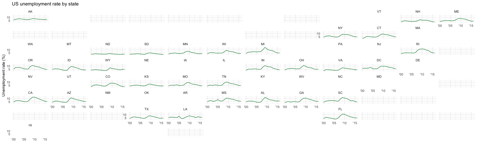
{geofacet} — small-multiple maps
{geofacet} arranges facet_wrap() panels in a geographic layout — same syntax, geographic positions.
Source: geofacet package
When to use which
geom_sf() choropleth
- Continuous variable encoded as fill colour
- Exact geographic boundaries matter
- Projection and scale are important
{geofacet} small-multiples
- Time series or distributions per region
- Trend comparison across regions
- When exact boundaries are less important than spatial arrangement
Summary
Interactive visualisation
- htmlwidgets (
plotly,leaflet,DT) add interactivity to any Quarto HTML output — no server required ggplotly()is the quickest path from aggplot2plot to an interactive one- Observable JS in Quarto enables reactive, filter-driven views without a Shiny server
- Shiny is the right tool when you need server-side computation or persistent state
Geospatial visualisation
{sf}+geom_sf()for choropleth and boundary maps with proper projection handling{geofacet}for small-multiple comparisons arranged in a geographic layout- Choose based on whether exact geography or spatial comparison of trends is the goal